Graphs
As I browsed the Vanderbilt Admissions pages, blogs, and various resources in a vain search for inspiration, a horrifying fact became apparent. Despite the large number of available lists, links, articles, pictures, and videos, the Vandy Admissions page is home to not a single graph. Zero.
ZERO.
As a Mechanical Engineering and Math major, I was briefly stung by this massive oversight. However, I have decided that my first contribution to Vanderbilt will be to attract exactly 100% of all accepted engineers and mathematicians to the University next fall by providing some useful and informative graphs. You’re welcome, Vanderbilt, and you can leave my paycheck in my Station B mailbox.


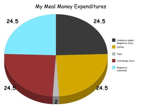
There’s a chance that I got my math wrong here… there are way more empty Cranberry-Apple-Raspberry bottles on my desk than Cran-Grape.

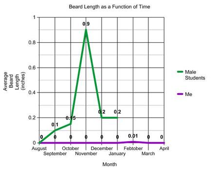
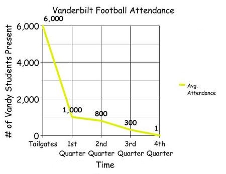
While the research and data collection that went into these graphs was, perhaps, less than some of the more stringent professors would require (or my middle school teachers), I hope that the figures can act as guidelines for Vanderbilt webmasters to come. I love graphs, Vanderbilt. Shouldn’t you?
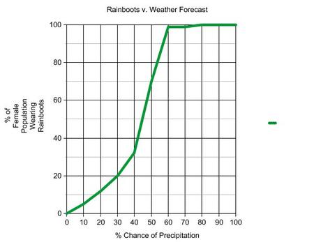
[In fairness to Vanderbilt, the statistics page got pretty close to a graph… it has a lot of numbers. Idea cred for Rainboots Graph goes to Elizabeth Keller, who doesn’t own rainboots.]